
Also of note: a custom fluted island surround painted to match the cabinets; a modern-looking vent hood; and, although you can’t see it here, a slim antique Turkish rug in front of the stove that adds warmth and character.
Backsplash tile: Clé
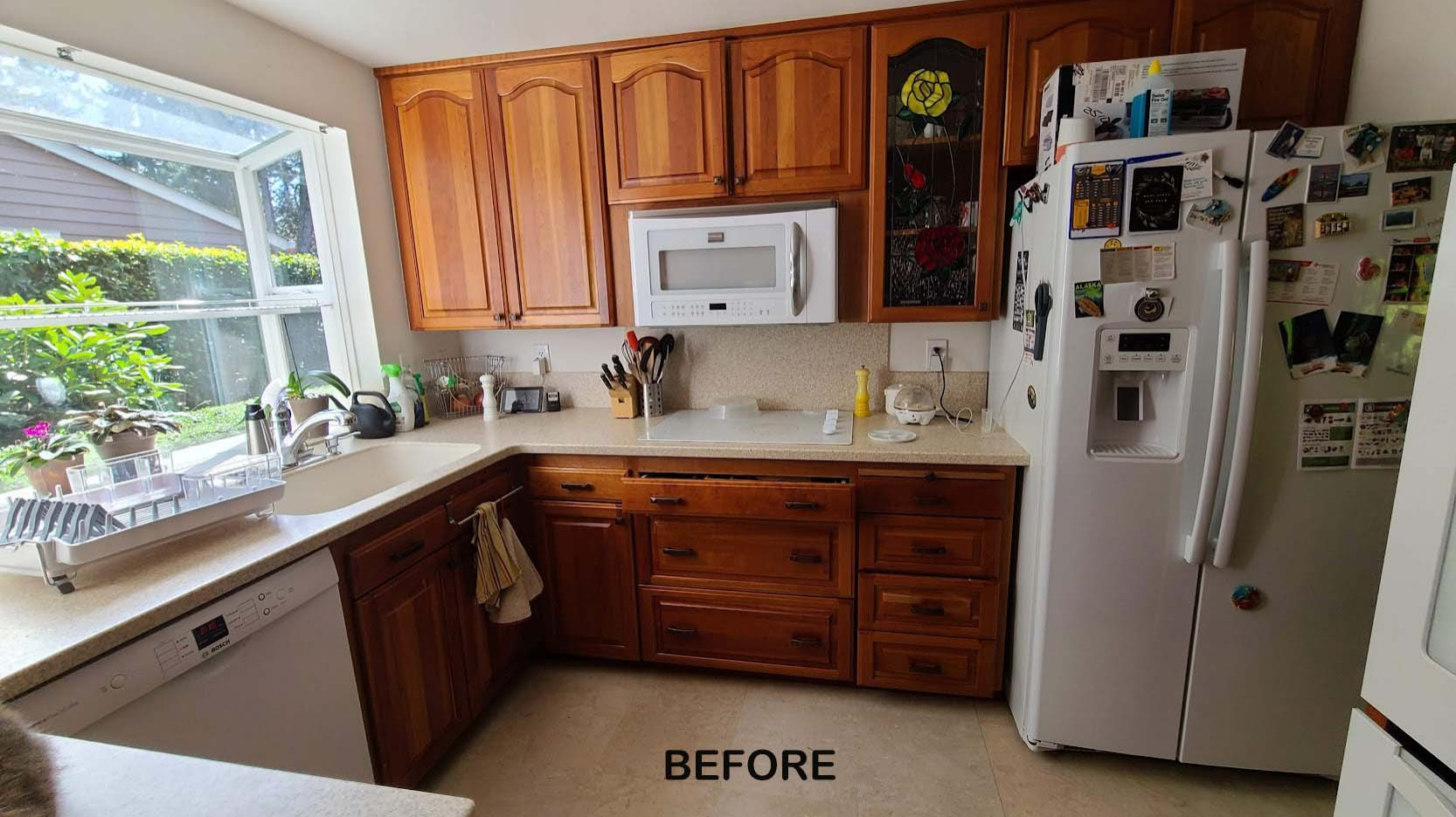
2. Open Source
Kitchen at a Glance
Who lives here: A couple
Location: Bellevue, Washington
Size: 215 square feet (20 square meters)
Designer: Ellen Weiss Design
Before: A narrow hallway led to this 1960s U-shaped kitchen in Washington state, meaning it was cut off from the dining room. A peninsula (partially seen in the lower left corner) and a cabinet bank also separated it from a breakfast area. What homeowners who love to entertain would be happy with that? Plus, the wood cabinets had an unflattering orange cast, the white appliances looked their age and the fridge stuck out. The homeowners brought on designer Ellen Weiss to remedy this unsociable and unstylish situation.
Happy surprise: Underneath the previous vinyl was oak flooring, which got restored to its former glory.
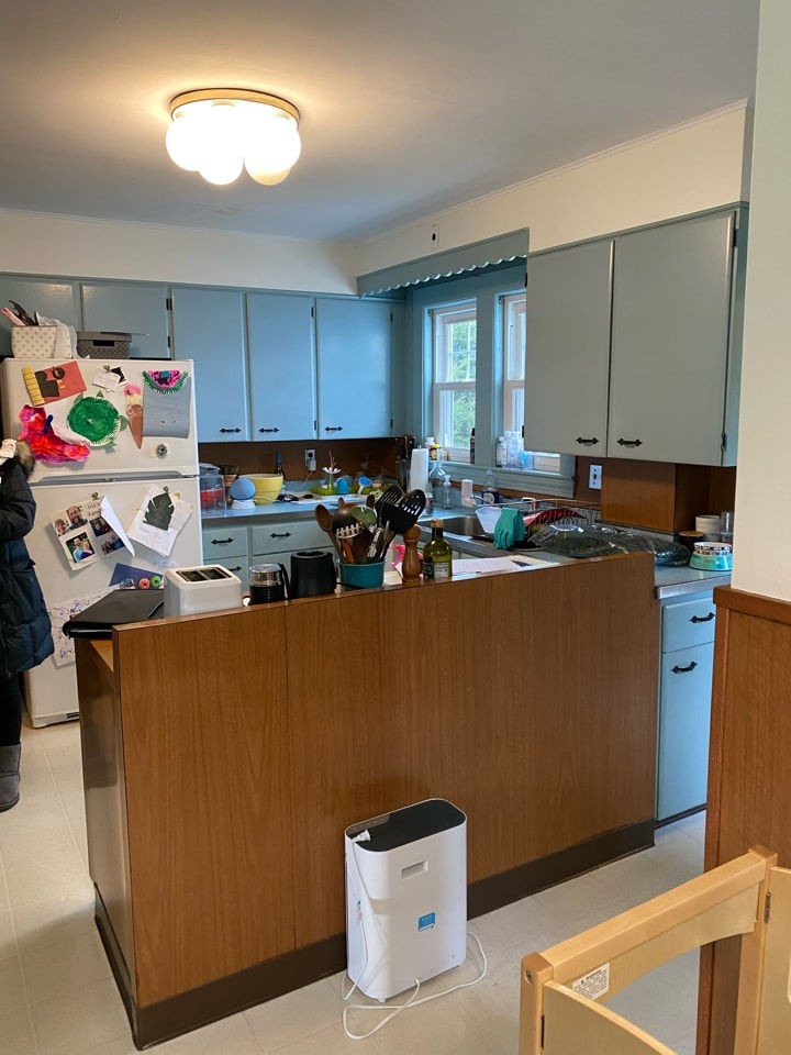
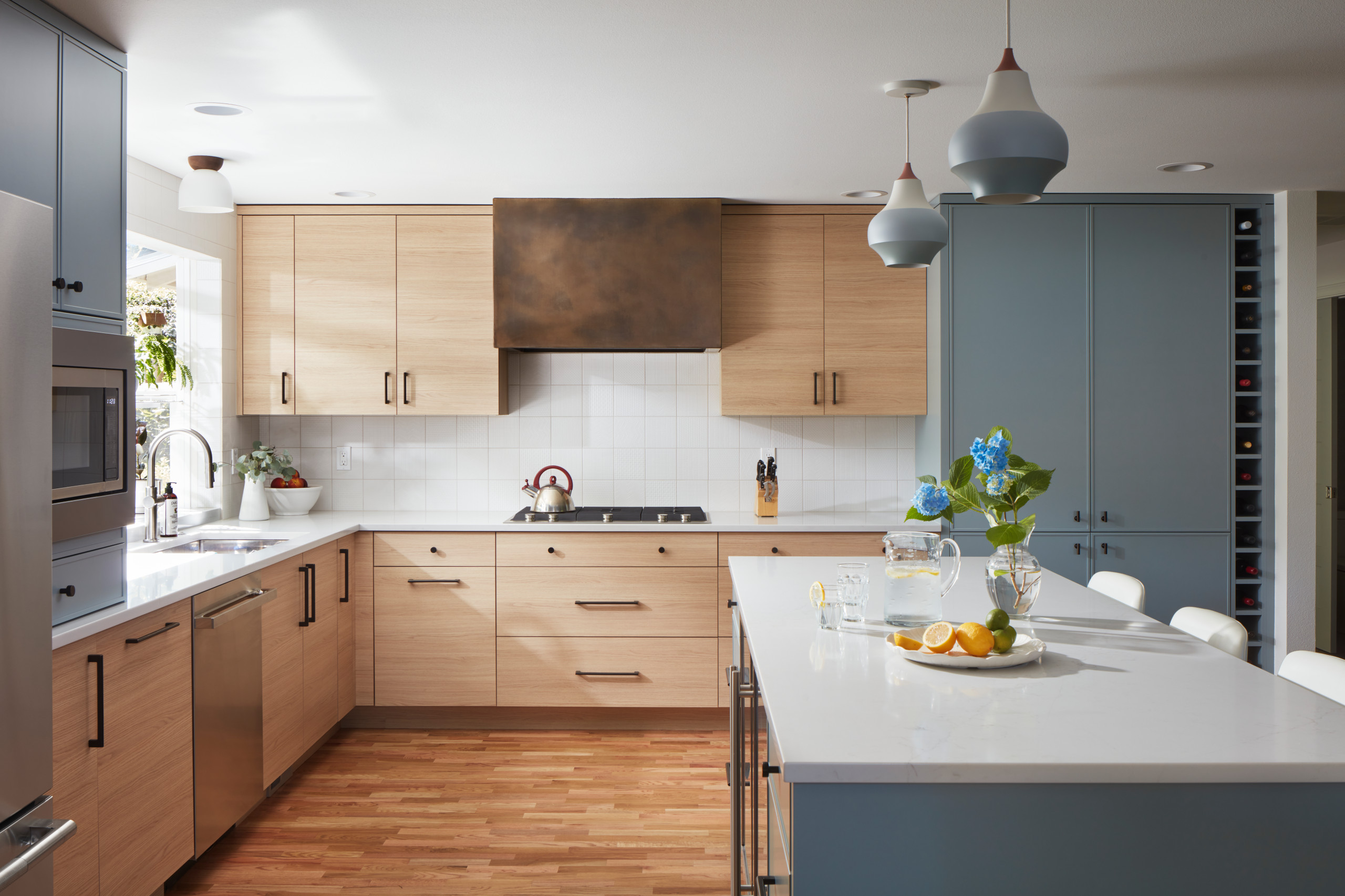
3. ’50s Flavor
Kitchen at a Glance
Who lives here: A couple with two young kids
Location: Medford, Massachusetts
Size: 195 square feet (18 square meters)
Designer: Jenni Jacobs of McGuire + Co. Kitchen & Bath
Before: With its tight U-shaped layout, dated features and inefficient storage, this 1950s kitchen in Massachusetts didn’t function well or look particularly appealing. The homeowners, who have two young kids, asked designer Jenni Jacobs to create a space that would have midcentury charm as well as modern-day sensibility.
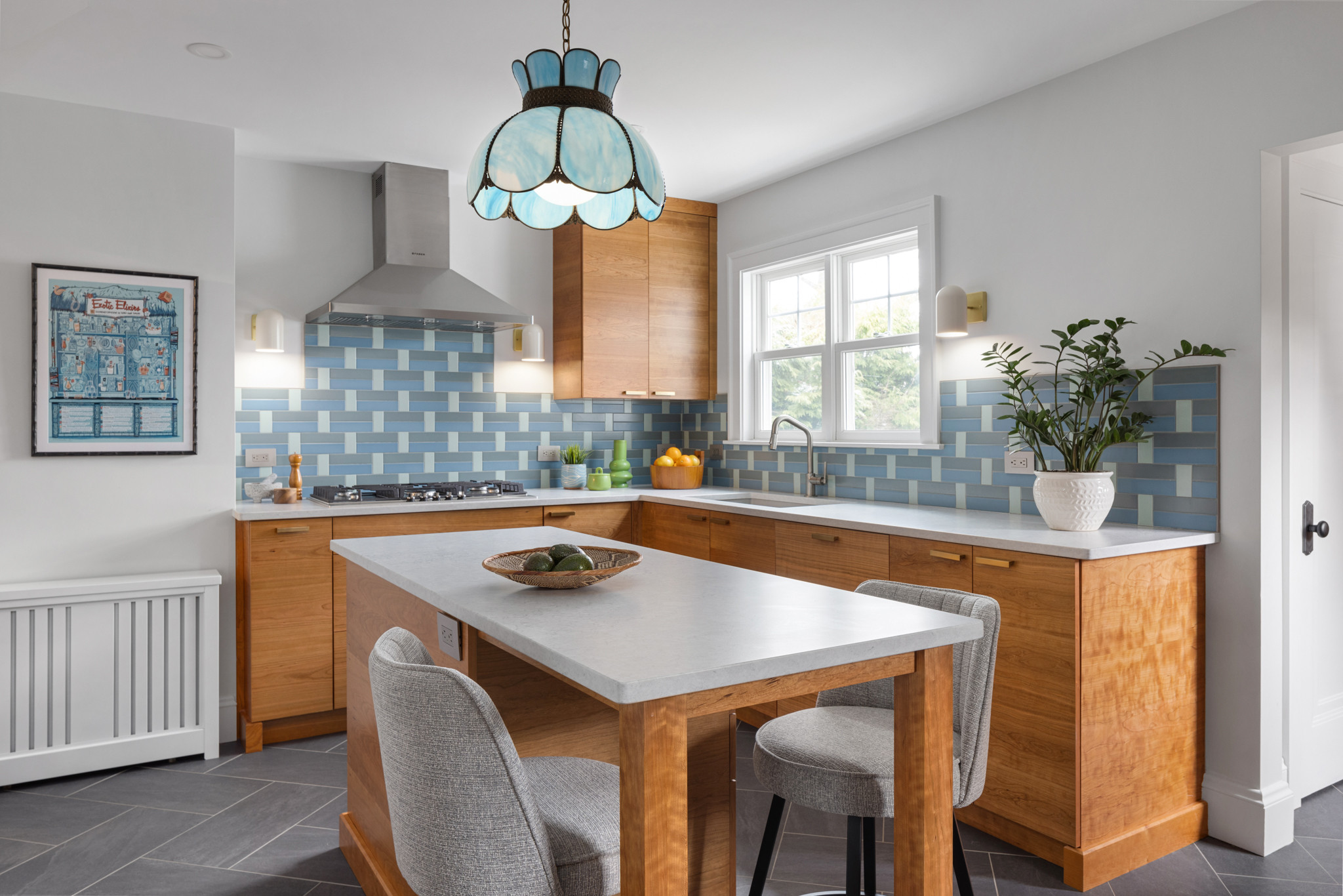
A blue glass pendant light that previously hung in the breakfast area inspired the new look and balances all the clean lines with its vintage silhouette. Artwork and backsplash tiles in shades of blue and green complement the pendant and play nicely with cherry cabinets. The cabinets are a flat-panel style with horizontal pulls, conveying a midcentury vibe.
This photo was taken from where the fridge is in the next photo.
Backsplash tile: Natural Hues collection in Rain, Ireland and Starlight, Daltile; cabinets: Seaside in natural cherry, Tedd Wood
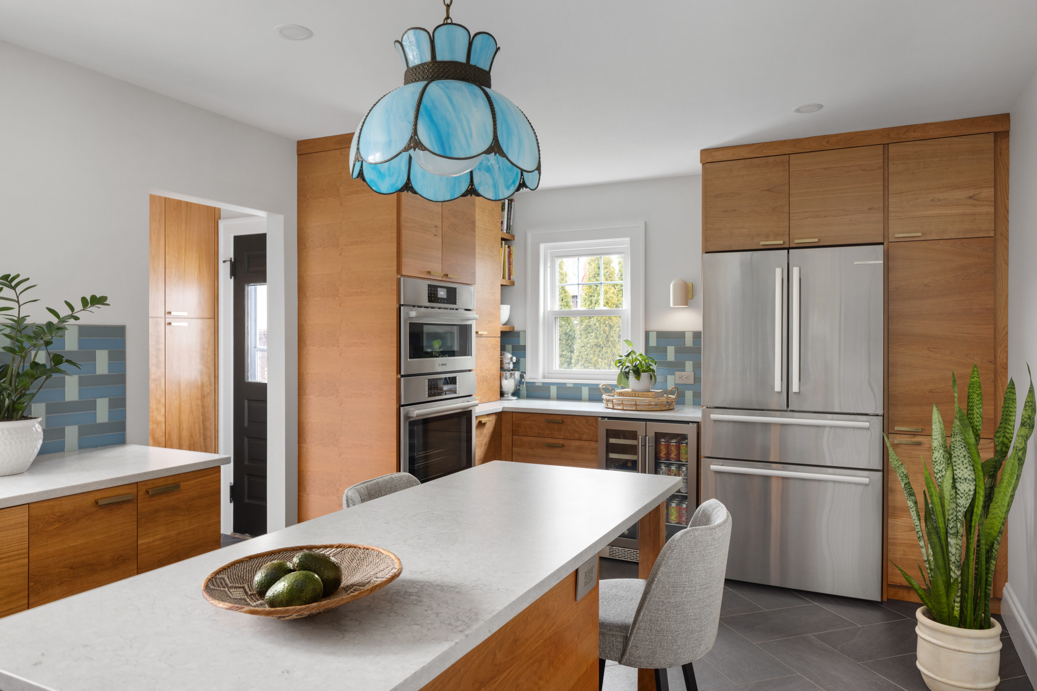
For better flow, Jacobs put that fridge, a beverage fridge and double ovens in the former butler’s pantry and breakfast area. She also moved the range to the opposite side of the room and added a vent hood.
Paint: Horizon (walls), Ceiling White (ceiling) and Pure White (trim), all Benjamin Moore; wall sconces: Allegheny, Schoolhouse
4. Switch Hit
Kitchen at a Glance
Who lives here: Two doctors and their two toddlers
Location: Dupont Circle neighborhood of Washington, D.C.
Size: 200 square feet (19 square meters)
Architect: EL Studio
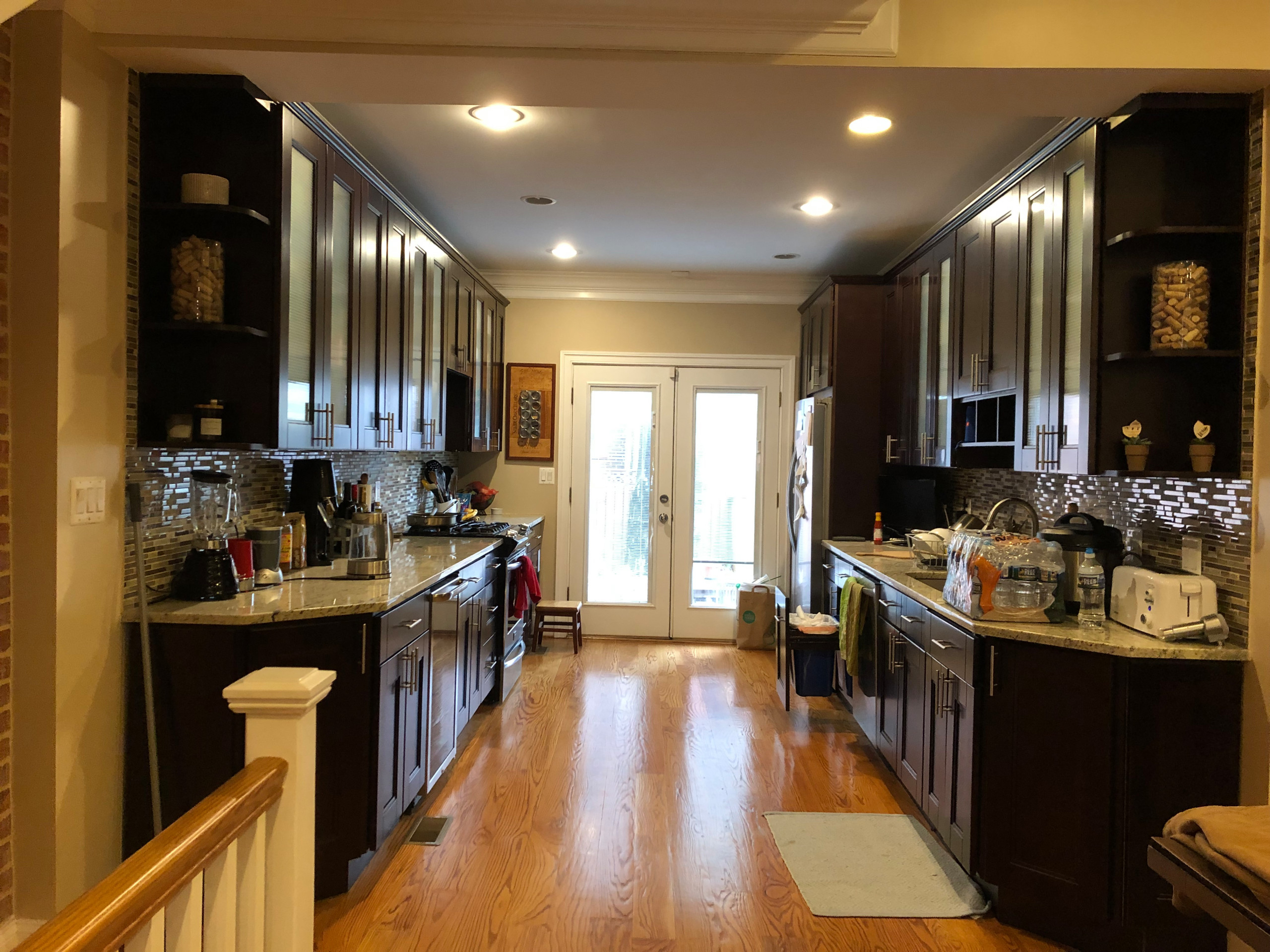
Before: Too wide for working comfortably and too narrow for an island, this kitchen in an 18-foot-wide Washington, D.C., row house also hindered a connection to the backyard (through the doors seen at the back here). Plus, the homeowners love minimalist modern style, which this kitchen didn’t have. They turned to architecture firm EL Studio for the remodel.
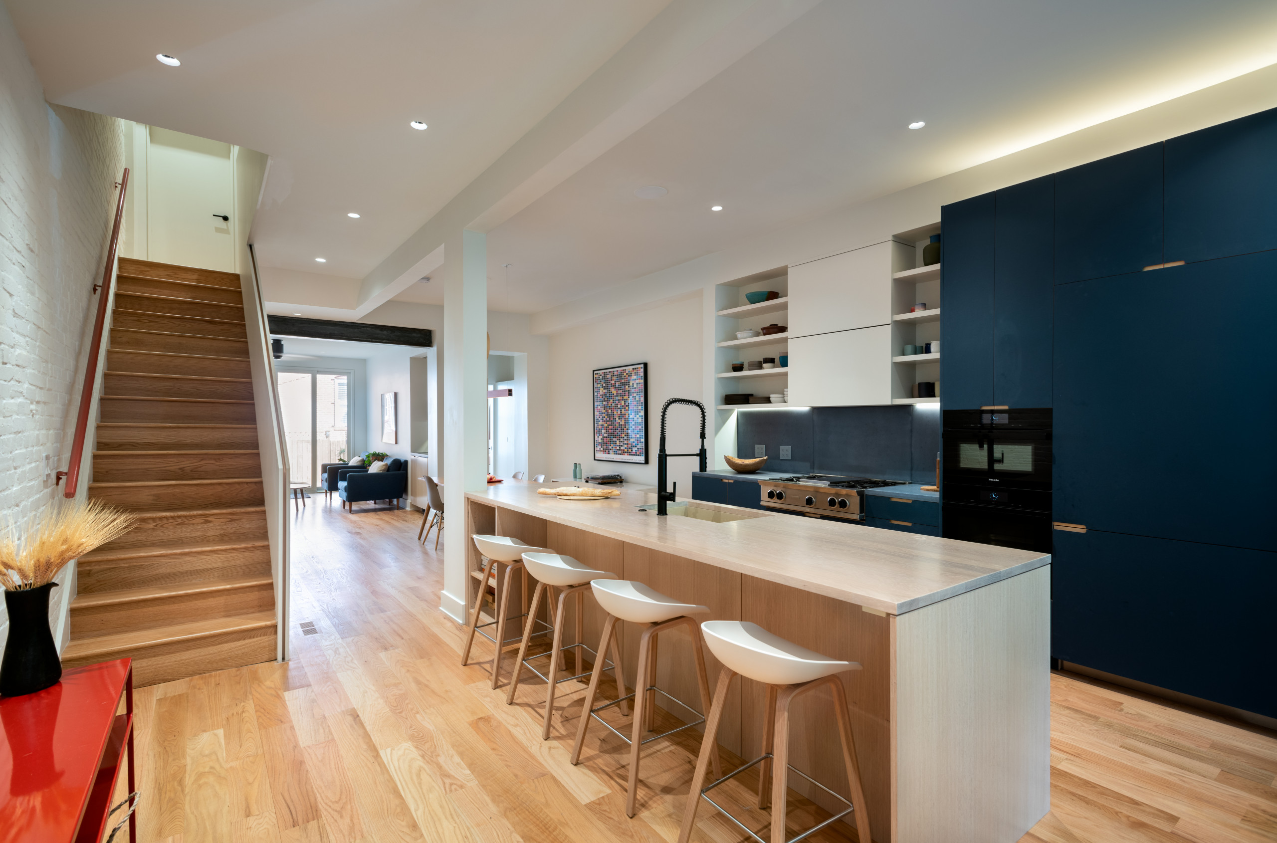
White oak via the kitchen island’s base and countertop complements the flooring and nearby stairs; all three warm up the space without weighing it down.
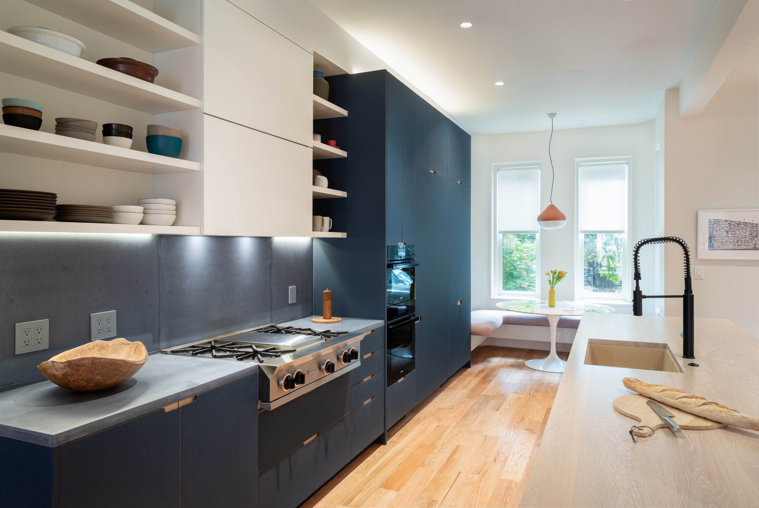
A new breakfast area by the front window offers views and a connection to the neighborhood. Its bench continues around the wall’s corner toward the entryway. And check out that acorn-shaped pendant light; along with the bright orange console table seen in the previous photo, it adds personality without bulk.
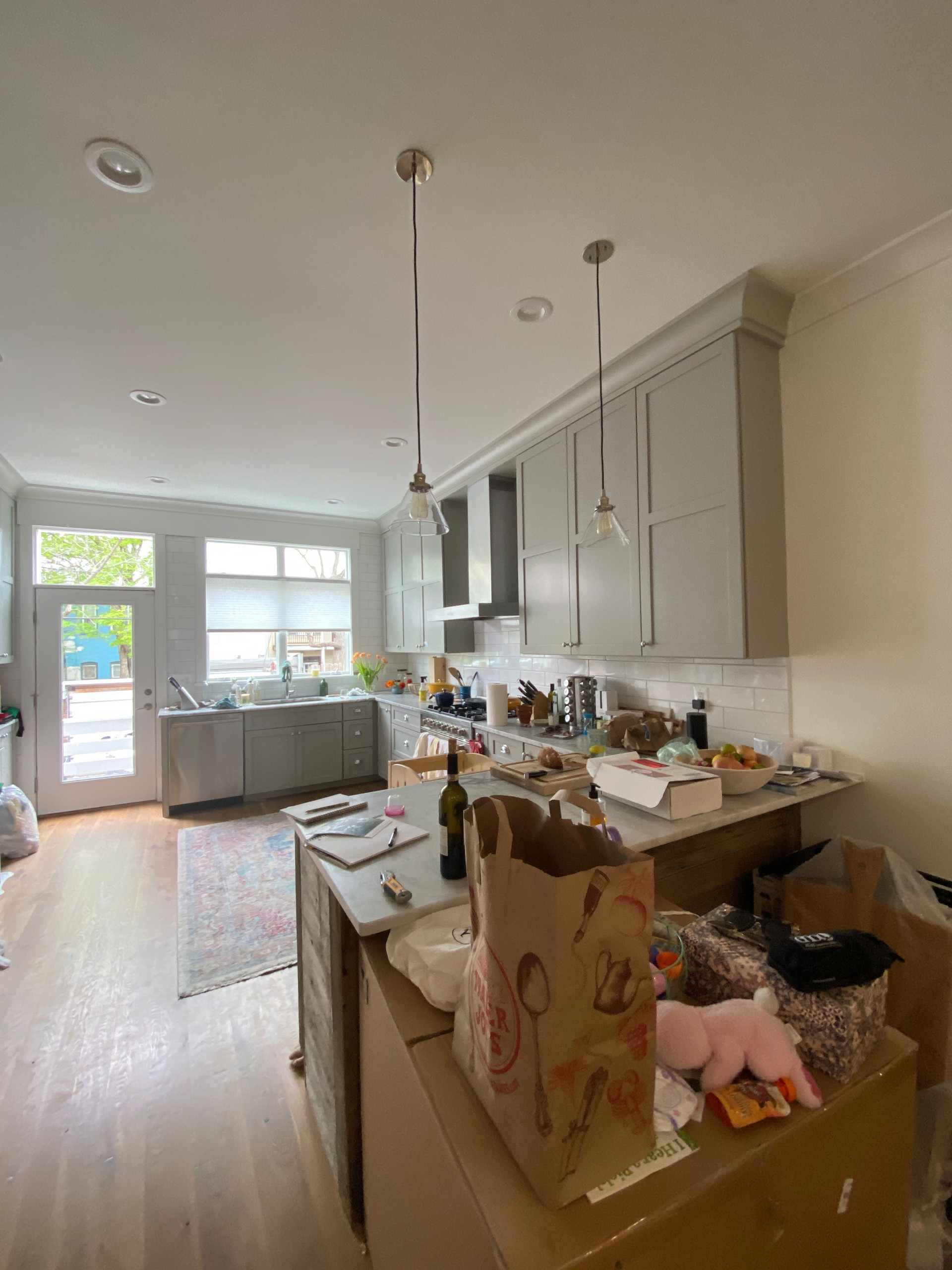
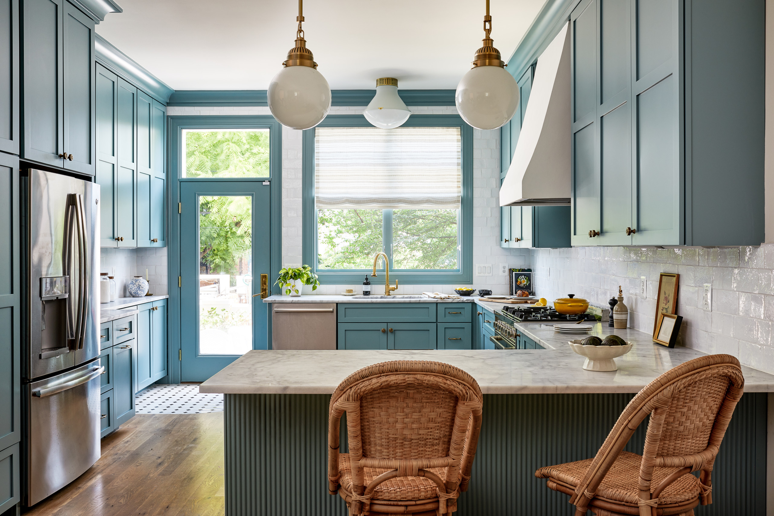
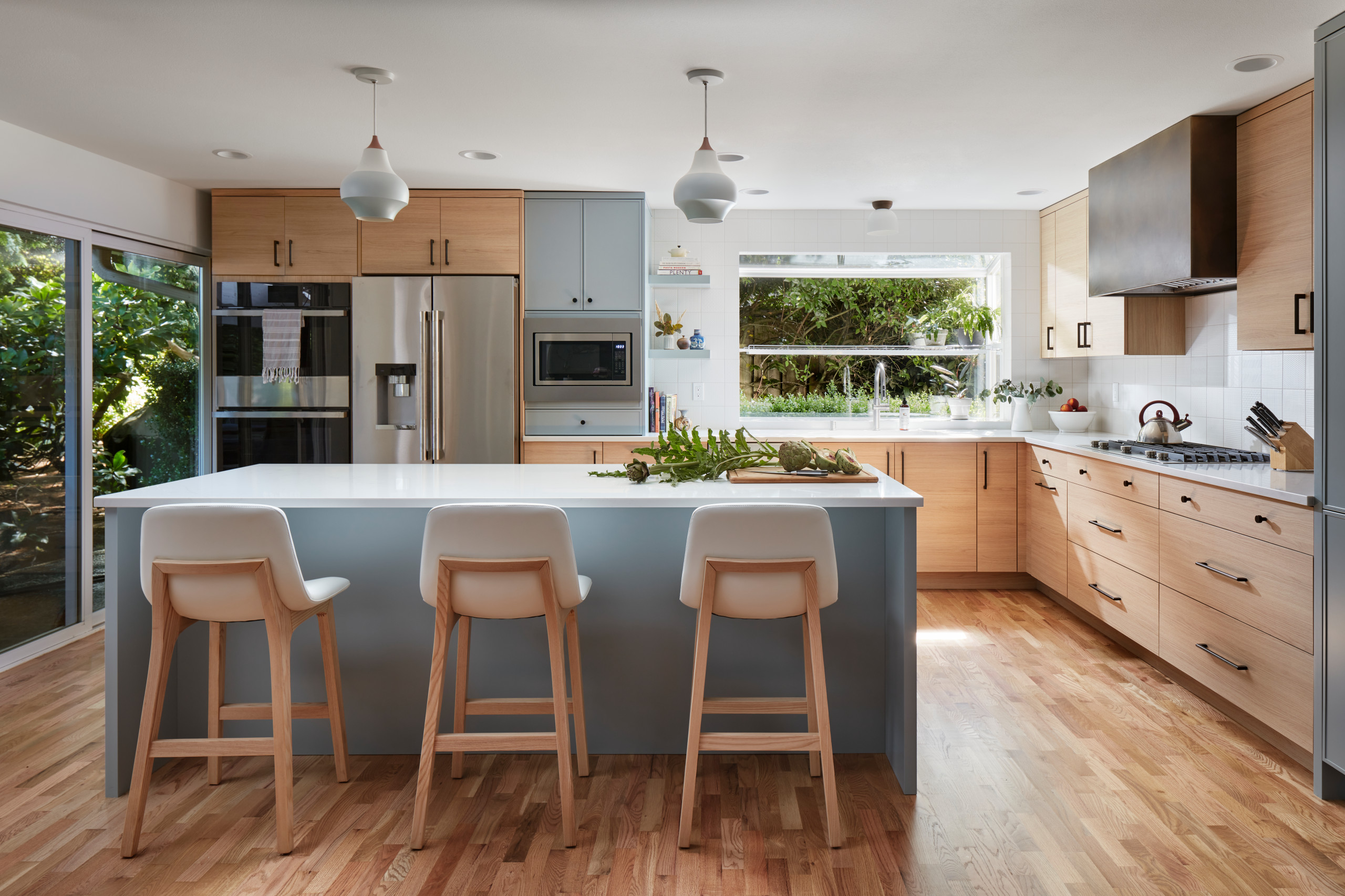
1. Capital Improvement
Kitchen at a Glance
Who lives here: A family of five
Location: Capitol Hill neighborhood of Washington, D.C.
Size: 220 square feet (20 square meters)
Designer: Sara Swabb of Storie Collective
Before: Interior designer Sara Swabb, had a tall style order when she took on the renovation of this farmhouse-style kitchen in Washington, D.C.: a modern European feel with California elements and nods to the home’s Victorian history. Not only did she serve up a beautiful result, but since the layout already worked just fine, she avoided the full gut renovation the homeowners thought they needed.
Repurposing the bigger features and keeping the footprint resulted in fewer items being sent to the landfill and major savings for the homeowners.